Relying solely on wireframes and design elements to create a great user experience (UX) simply won’t cut it—but why not? Because an easy to use and visually appealing website falls short if the content isn’t there to back it up.
To create the best experience possible, you need to give users what they want: information.
Users arrived on your site because they’re in need of information; whether it’s to find customer reviews, product pricing, contact information, or store details—it’s all information, and it’s all content. The aesthetics may have caught their attention initially, but if the information your users are looking for isn’t there or easy and interesting to follow, they’ll leave with an unpleasant experience they’re sure to remember.
How Users Evaluate a Website
The first step to uncovering the importance of content in UX is understanding how a user evaluates a website when they first land on the site.
According to Nielsen Norman Group, a company known for their evidence-based user research, a user evaluates a website in three steps:
- Decides to stay or leave based on design elements and functionality
- Scans for expected information
- Chooses a path by engaging with a CTA
Before reading any content, users often scan a website to assess if they’ve arrived at the correct place. The first 10 seconds of a page visit are critical, with it being all the time a user needs to make the decision on whether to stay or leave your website.
But what if a user decides to stay? That means in just a few seconds, they chose to engage with the website further. At this stage, quality content becomes highly impactful and critical to the user’s experience.
How Content Applies to UX
First things first, a user lands on your website and makes the decision to stay on your site. Now is the time to be utilizing content to improve their experience.
By Drawing Users In
Once a user has chosen to stay on your site, you want to hook them in with content that’s clear, concise, and useful.
Users want to easily find the information they came to the site looking for, using as little effort as possible. This is best achieved by prioritizing and structuring your content so that the most important information comes first on the page, additional details on the topic come second, and any background information is saved for last. This is easily illustrated with the Inverted Pyramid.
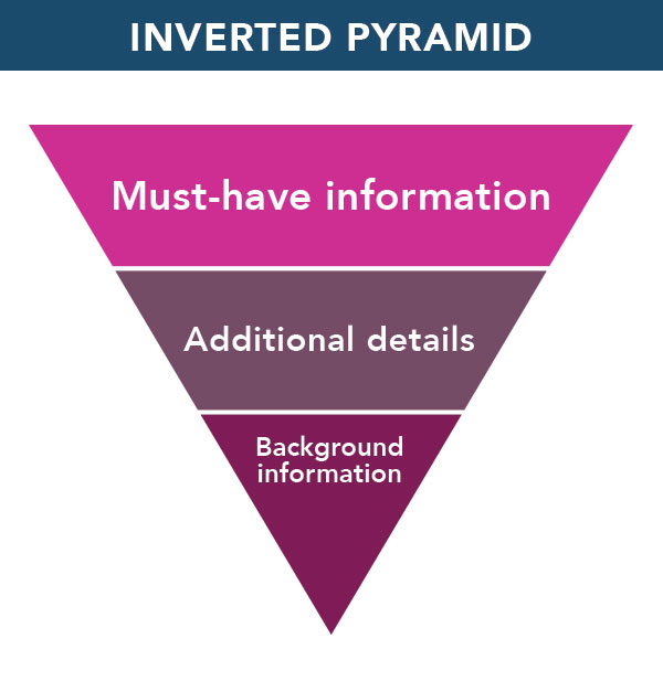
By writing with this method in mind, a user can read one to two lines of copy, get the general idea, and then choose whether they want to read any additional details below by scrolling down the page.
Another way to hook users in is by increasing the readability of your content. Make your information easy to scan, read, and comprehend by incorporating the following methods and formatting techniques into your content:
- Headings
- Bullet points
- Numbered lists
- Graphics
- Less jargon
- Memorable messaging (e.g. rhyme and alliteration)
- Short sentences
- Small paragraphs
- Smooth transitions
Although these may seem like small adjustments to your content, they can have a big impact on the user experience. The prioritization, readability, and quality of your content will greatly determine if a user chooses to engage any further with your site and ultimately whether they decide to convert.
By Driving Engagement
When a user lands on your website, they often quickly absorb the elements on the page in order to browse the site accurately.
Here is a website example for Humboldt, a county in California that offers a variety of things to do for family vacations, romantic getaways, and more. Unlike a typical vacation destination that lists all of their attractions for users to read through, their website uses fun designs, catchy content, and interactive functionality, making it exciting to explore what Humboldt, California has to offer.
When you first arrive to their homepage, the content provides information and drives further engagement by encouraging users to “follow the magic.”

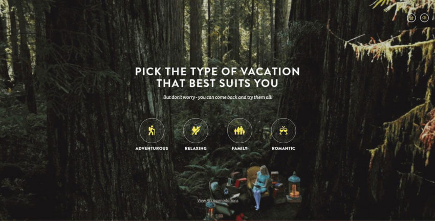
Once a user decides to enter the site, they are met with a few options:
- Choose their vacation type
- View all accommodations
- Go back to the homepage
Take note that the content clearly tells the user what he or she needs to do next, each icon supported by a label. You’re then given a set of instructions and a clear call-to-action.
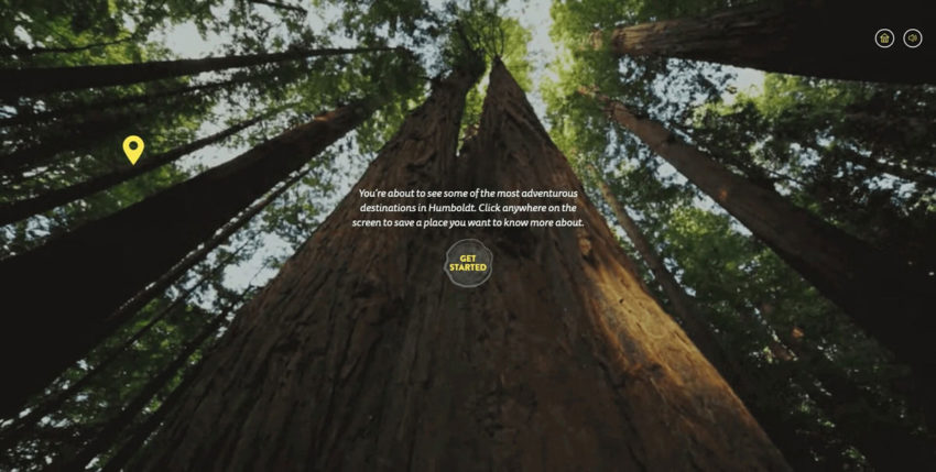
After the users save the places they want to learn more about, the site offers useful information on the destinations users were interested in.
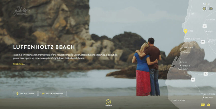
At this point, the user has thoroughly engaged with the site, which increases their commitment to explore further.
At the end of the user’s journey, the Humboldt website makes it extremely easy to save all the information they chose as a personalized itinerary which can be either printed or emailed to them, or they have the choice to explore more destinations.
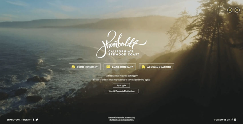
The Humboldt example was successful in driving engagement by not only providing informative content, but by pairing that content with visual elements that made the experience of learning about the county fun and exciting. The website also offers a clear value proposition and provides only the information that the user wants.
By Impacting Design
Sure, it’s possible to design a website without final content—you can write it all during development once the mockups have already been finalized, and then simply enter in all the content once the site is nearly complete. The issue with this approach is that your visual designer is basing their mockups off placeholder content used in the wireframe. However, if the designer had real (or close to real) content to reference beforehand, your website could have been even more thought out, visually appealing, and customized. Here’s why having content before getting into mockups has such a positive impact on the final product:
Content provides context. It gives designers a foundation and an idea as to what they’re trying to visually communicate. Without content, you’re leaving designers to use their best judgement to create a design that accurately coveys a message they know little or nothing about.
The tone of the brand and content may also influence the style of design. It guides designers to choose certain colors, imagery, and typography that fully supports the personality of the company.
The content you provide your designer(s) doesn’t have to be final. From my personal experience, I’ve realized the chances of having perfect, approved content completed before or during the design stages are slim to none. For times like these, you should be using proto-content.
Proto-content: placeholder text that provides more context than lorem ipsum without being the final, approved content. Some of the ways you can implement proto-content include:
- Current site’s content
- Drafted content
- Competitor content
By having content to reference, designers will not only create a website that successfully conveys the message but will also present it in an organized layout based off the wireframe. They can make important design decisions that have a great impact on the user experience, such as:
- Contrast: content can be easily read and callouts stand out
- Transparency: content can be read even with a glare on the screen
- Font size: content can be easily read without unnecessary strain
- Grouping: content is organized using white space
- Proximity: relative content is placed closer together
What You Should Takeaway
Don’t treat content as an afterthought.
Valuable content adds to the overall user experience and helps create a successful website. As previously mentioned, it plays a significant role when a user is evaluating your website, helping them decide whether to stay on your site. If they decide to stick around, the functionality of the site, design, and content must all work together to attract potential customers and guide them through the customer journey successfully.
