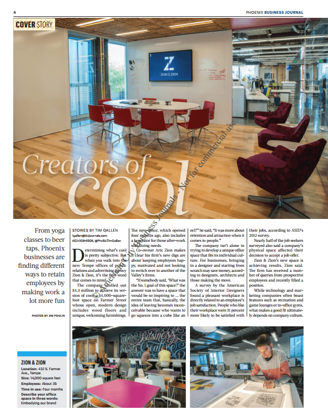
There had been much excitement about the new Zion & Zion building, leading up with construction, interior design and now the official move in. Timing on our official move was perfect, and we were asked to be a part of a large /feature piece in the Phoenix Business Journal.
Reporter, Tim Gallen, toured our space and interviewed our CEO, Aric Zion on the thought process of spending money on extra items that most work place environments wouldn’t dream of.
“The primary goals were to create a space that would inspire our existing team and attract new talent as we continue to grow.,” stated Aric in an interview with Tim.
Designed for Collaboration

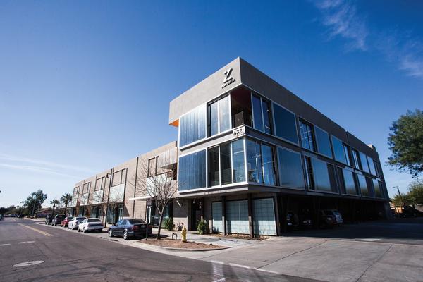
CEO Aric Zion and COO DuGue Zion had a vision for their new offices of a bright, open, modern and comfortable environment for their team. They chose an expansion of Farmer Studios in Tempe as their new building location for its raw architectural expression and vast northern exposure. Architekton used the graphic language of Zion & Zion to help provide the connections to link critical spaces across the very long and narrow (250’x25’) footprint. This graphic language also informs room and furniture configuration as a glossy pink beam intersects one space to the next, diffusing a turn in the floor plate.
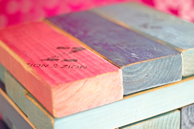
The primary goals were to create a space that would inspire our existing team and attract new talent as we continue to grow. Additional goals included ensuring that space would embody our brand. That was realized by having the angular aspects of the new Zion & Zion logo translate into the physical design of the furnishings and architecture.
The space’s design incorporates a visual representation of the intersection of “business” and “creative” as a 10 degree line cuts through the entire office, from the ceiling to the desks to the floors. You’ll notice the angle more obviously in the brightly colored beam that hangs from the ceiling on the top floor and more subtly in the custom cut of the desks constructed in a way that mimics the angle. The office consists of two levels which make up the 14,000-square-foot facility, completely designed with collaboration in mind.
Programmatically, the Zion & Zion building is designed to allow creativity to happen anywhere and take any form: whether it’s the formality of a closed-door client meeting, the casual in-house team jam session, or spontaneous inspiration with clients and colleagues over a game of pool. The convergence of project workroom and game room create The Intersect. An operable glass partition combined with 10’ hanging pink felt panels provides the option of privacy while maintaining a visual connection to the playful spirit of the space. The Arena offers both small group meetings all the way to large presentation space with its operable glass partitions and tiered wood seating. Did I mention the two full-size kegerators, wine fridge, fully equipped kitchen and a surround sound movie theatre?
Benefits of the Design
The Zion & Zion team quickly saw an increase in efficiency and collaboration (via the Room Wizards, touchscreen technology and the ample supply of both enclosed and open meeting space).
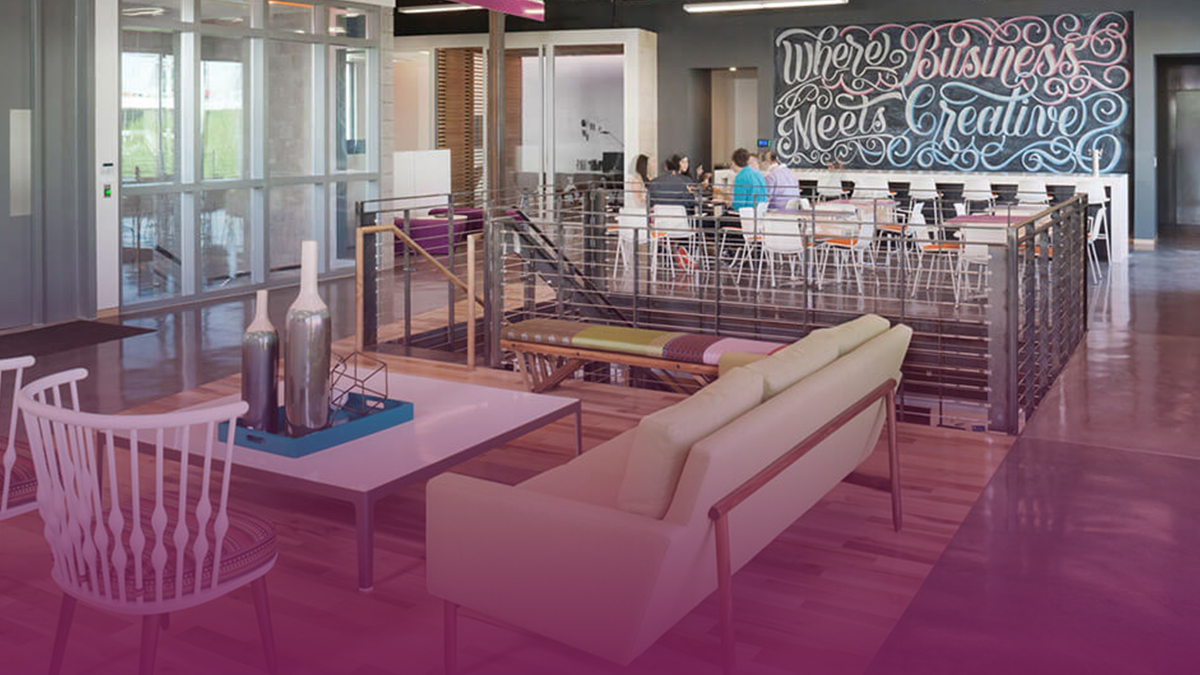
A main area of the new Zion & Zion building, The Café, not only provides break room space for employees; it is also used for client events and impromptu brainstorms. Projection provided in the Cafe can be used for media screening or presentations. Touch-down spaces throughout the open workstations provide team work environments, and the formal Conference Room includes a suite of spaces designed for client use including a lounge and hoteling work stations.
Diversity and integration are further expressed in the use of material and architectural styles in the space. An eclectic mix of traditional wood, modern steel and glass create a playful, but elegant approach to the overall design. Custom-made wood slats take on an organic sensibility against the more machined look of finished wood paneling. Traditional hand-turned door pulls are used on large glass pivot doors. Color and pattern energize key areas within the bright space. This is not only exploited by such traditional means as paint and textiles, but also on video monitors and chalkboard installations.
New Branding Brings Everything Together
And the finishing touch was the new branding reflected in the Zion & Zion logo and website, which was specifically designed with two aspects in mind; a visual reflection of the two Z’s within the company name, but more importantly, a representation of how our mantra – Where Business Meets Creative – brings both business acumen and creative thinking together – as one – in serving our clients and their business needs.
Additional goals included ensuring that our new space would embody our brand. That goal was made a reality by recreating the angular aspects of the new Zion & Zion logo into the physical design of the furnishings and architecture.
View the Article
Click here to view the full story.

