About Hand-Lettering
Essentially, hand-lettering is the process of drawing letters, by hand of course. Most of the time, lettering is needed for custom logotypes. In addition, posters, t-shirts, greetings cards; the list goes on and on.
Lettering to me is almost a lost art. In this day and age of computers and everything becoming more automated, lettering seems to get lost. That’s why clients love custom lettered logotypes, because it’s the handcrafted aesthetic and knowledge that their logo is unlike any of their competitors (if done right).
Letterform Weights and Styles
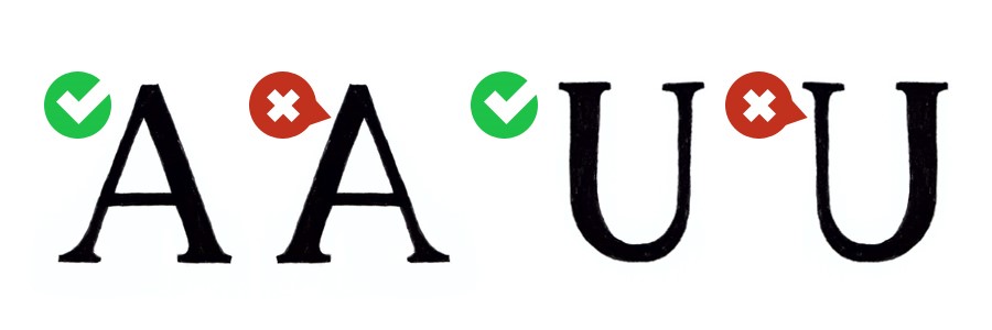
Understanding the basics of how letterforms should look is essential. Along with knowing various styles such as: Serif, Sans Serif, Blackletter, Script, etc. In the example to the left, you can see the stroke of the capital “A” needs to be thicker on the right side. In addition, the capital “U” needs to have a thicker stem on the left side. Or how an “o” has a thinner weight on the top and bottom, with the thicker weight on the left and right sides. Those examples are just some of the many things to look out for when practicing drawing forms. The best way to grasp and understand how certain letterforms should appear is to do some research! Open up a word document and type out a word to view how each letterform is formed. Check out some typography books from your local library. Even take a walk and view all the typography around you.
Getting Started
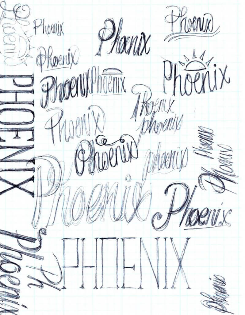
If inspiration is needed, there are TONS of online resources to view works by very talented letterers. The best way to really get the look and feel for a project is by forming a “mood board.” A mood board is essentially a collage or a group of photos, things, words, places, etc. that depict a certain “mood” or idea that you’d like your project to go in.
In the example below, here are pieces I designed and arranged them for you into a “mood board” to encapsulate an idea of the word “inspiration.”
Inspiration
Process
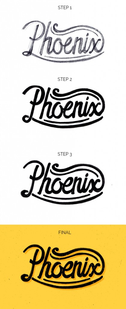
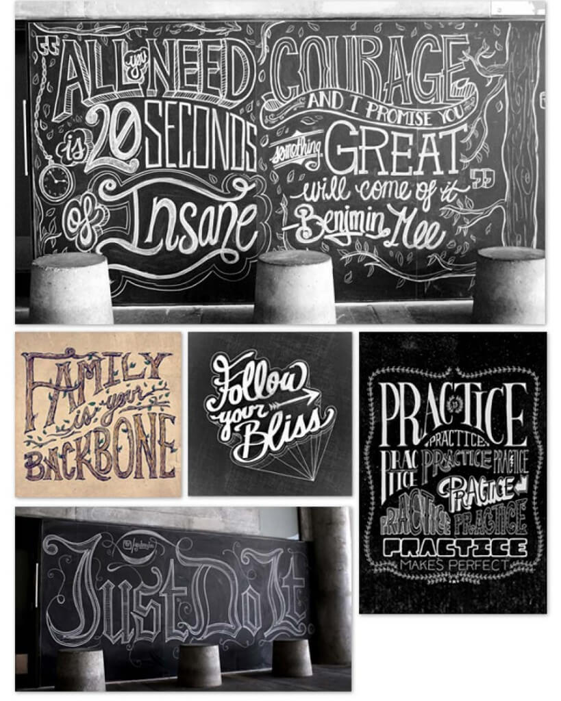
The basic process of beginning hand-lettering is to sketch out various methods of styles and shapes of the letterforms. Once an initial concept is liked/chosen continue onwards by refining that sketch. The easiest way to do this is to use some tracing paper and draw right on top of the initial sketch. Then to refine some more, use the same process and trace once again until each letterform is finalized and drawn the way you’d like. Finally, add colors, textures, or whatever it may be to give it that extra “umph” to really finalize the lettering.
In the examples you can see the step-by-step process I took when sketching out the word “Phoenix.” Overall, I knew I wanted a brush script. But, I attempted other styling of the letterforms just in case I ended up liking something else.
With the final piece, (depending on the project) you could vector it and really make it crisp and clean. But with this piece, the handmade aesthetic is what I’m going for, so vectoring wasn’t necessary.
Continuing Onwards
Hopefully the above information is a good enough start for you! Just remember, “Practice makes perfect.” Without practicing drawing letterforms, you will never nail down the essentials of what a specific letterform should look like. Some great letterers to look into would be Jessica Hische, Dana Tanamachi, Ryan Hamrick, Drew Melton, and so many others! View other designers’ work, take photos of old signs, take a walk, and practice, practice, practice.
