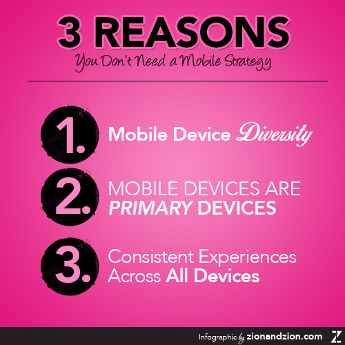
Yes, I said it- you don’t need a mobile strategy. Now, before you go on kicking and screaming, let’s think back about 5 years when companies were just starting to create mobile sites. It was an afterthought, something you added on once you realized that potential customers were trying to get to your cool new flash site from their phones, and couldn’t. So what did you do? Quickly figure out a mobile strategy and get a mobile site up! Today /mobile accounts for 28% of web traffic; it is so prominent that it shouldn’t be an afterthought. You don’t need a separate mobile strategy- your web strategy should cover mobile, tablet, desktop, and everything in between. Here’s why.
Mobile Device Diversity
With so many different types of mobile devices, from smart phones, tablets, mini-tablets, giant tablets, mini-laptops, giant laptops, desktops, and pretty much every possible combination between, we can’t possibly keep up and make a separate website for each device. Your web strategy should be to create a site that will work on all existing devices- and any new device that will come out in the next few years.
Mobile Devices are Primary Devices
It’s a common perception that mobile users are “on the go” and only looking for contact information. While it is true that a large percentage of mobile users are in fact looking for contact information, there’s one important thing we can’t forget- screen size is not context! Let’s say you’re sitting at your doctor’s office waiting for 45 minutes for your appointment. What do you do? Grab your phone and browse the internet. Maybe you’re shopping for a gift for a friend, or maybe you’re searching for a new doctor that won’t make you wait 45 minutes! Either way, just because you’re on your mobile device, you are not “on the go” and only looking for contact information. You would expect to have access to the same information that you would from your laptop, tablet, desktop, or phablet.
Consistent Experiences Across All Devices
A report from Google (/read full report here) states that 90% of users start a task on one device and complete it on the other. Let’s jump back to our doctor’s office scenario- say you found a gift for a friend while waiting for your appointment, but didn’t have the chance to buy it before getting called in. When you go home after your appointment and jump on your laptop to purchase the gift, you would expect to have the same or similar experience as you did on your phone. Having a separate mobile site means that users are going to have a separate experience from one device to the next. If you don’t want that for yourself, let’s not give that to your users either.
What’s the moral of the story? You don’t need a separate mobile strategy, you need a web strategy that covers every device we have now, and every device that is likely to come out in the future. This is called responsive design; a website that adapts to every screen size. It allows your website content to stay the same, but to be optimized and easy to use on every device. Next time you are redoing your website be sure to give your users the same experience, the same content and the same information, no matter what size screen they are using- because remember, screen size is not context!
