One of the best perks of working here at Zion & Zion is that our bosses send us to two conferences a year, completely of our choosing. While I have attended /HOW Design Conference in Boston as well as /Adobe Max as a result of this fantastic program, neither of these compared to the creative intimacy that was the /4th Annual Creative South Design Conference in Columbus, Georgia. This was a casual collection of some of the most talented illustrators and designers in the Industry, all coming together to talk about how they got to where they are today and what all of us aspiring creatives should be doing to be just as awesome. In addition to the two days of impressive speakers, my colleague, Scott Biersack, and I also attended a full day of workshops before the conference began. As a result of the skills we took away from the workshops, the incredible speakers, and the adorable quaint downtown experience that was Columbus, Scott and I headed back home feeling creatively energized and refreshed.
Our Journey to the Georgia Peach
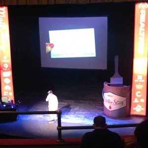
Columbus is about two hours south of Atlanta, which required us to rent a car and drive there once we got off the plane. The scenery, even at night, was beautiful. Knowing ahead of time that we were headed to “/Walking Dead Land,” Scott and I couldn’t help but imagine walkers dragging themselves along the side of the very dark and lonely stretches of highway. It certainly made for an entertaining couple of hours. We stayed at the /Marriot right in the heart of downtown Columbus, which was absolutely stunning. The rich architecture just screamed history and culture as it was an old mill that had been converted in 1983. Every building in downtown Columbus seemed to have that same sense of the old converted into the new, which as designers we found fascinating. Several of them even had their original hand-painted signage, which, juxtaposed against the modern hustle and bustle of this small town, made it even more beautiful and interesting. The conference itself was held at the /Springer Opera House, a true gem in the heart of the south. This was a venue that truly inspired creativity.
Getting Our Hands Dirty at the Workshops
The day started very early for us west-coasters who were still 3 hours behind. After grabbing a coffee and breakfast at what could be the cutest café we’ve ever seen (It was a bank that had been turned into the café, and still had its original vault doors! Too cool; we were geeking out) we headed to a workshop on Typography Design by Mattox Shuler (@MattoxShuler). This class was less about actually drawing type and more about the vocabulary of typography, which Scott and I both felt was just a little bit elementary for anyone who had gone to design school. Of course, there are plenty of self-taught designers who never had that formal education who probably really enjoyed that course.
Sean McCabe’s Hand-Lettering Workshop
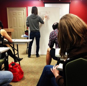
Afterward we went to a hand-lettering workshop led by Sean McCabe (@seanwes), one of Scott’s personal lettering idols so he was super excited about learning from the master. Sean struggled to get the white board and markers to cooperate, yet still managed to give tangible advice on how to properly letter.
Good Times and Collaboration Workshop
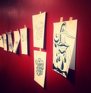
The next three workshops were truly hands on so we finally got a chance to get our hands dirty. The first was called “Good times and Collaboration” which was led by two guys who met at a conference and became the best of friends. This one had us in teams and we essentially played a game of visual telephone. Where one person at the beginning of the chain was given an anagram that they had to illustrate, then the next person would letter what they thought was happening in the picture. The next person then illustrated those words and so we alternated all the way to the end. The anagram we had was “Vampire Bat Party” in which case we all stayed pretty true to. By the time it got to Scott and I at the end, he lettered what I thought said “Vampire Ball” but actually said “Vampire Bat” so my illustration turned out to be very much /Salvadore Dali inspired and abstract. Two other teams had “Baptism Pirate Rave” which yielded a hilarious variety of interpretations.
Derek Castle’s Block Printing Workshop
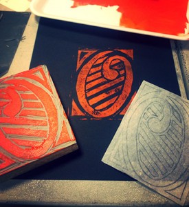
The next workshop was on block printing presented by Derek Castle (@strawcastle). Now that was awesome; I hadn’t done anything like that since my high school art classes. Derek’s work was incredible, and so detailed. I can only imagine the patience and dedication it takes for each project he works on. It’s a fairly ancient technique, so it was exciting to see a creative who is bringing that skillset into our modern digital world. We each got a letter from a phrase that we had to draw, transfer on to the wood block, and carve it out. Despite many stories shared around our table of past casualties with these types of carving tools, Scott still managed to become another victim. He took it like a champ though, slapped on a bandage and continued to work on his piece. We applied various colors of ink to the blocks and printed them on black paper. We were really happy with our final pieces, although the actual printing part turned out to be quite a challenge.
Boutique Screen Printing Workshop by Mama’s Sauce
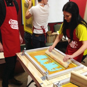
The last and final workshop of the day was presented by Mama’s Sauce (@mamassauce) out of Orlando, Florida. This is a boutique screen-printing shop that truly produces art. They work with their clients to select the perfect paper and ink combinations for their posters, leading to some stellar work. They set up mini old school screen printing stations for us to print our very own piece. They were so knowledgeable about their craft, we had a great time asking them as many questions as we could so we could further understand the screen-printing process.
The Talent
As mentioned a couple times already, the lineup of speakers was really impressive. They seemed to have attracted some of the top letterers and illustrators in the industry. Below is just a taste of the Talent that graced the stage of the Springer Opera House.
Justin Mezzell
Justin (@JustinMezzell) is an illustrator and designer based in Orlando, Florida who works at Code School. He considers himself to be an illustrator who can’t draw (although I saw what he came up with during the workshop and I beg to differ). He has some really awesome Photoshop projects that he’s done for several big name clients. His energy while presenting was truly electric, I almost wished every presenter had that same composure.
Nathan Yoder
Another personal idol of Scott’s, Nathan (@NathanYoder) is an illustrator and designer who works for Sevenly, and has also gone the advertising agency route in the past. If you check out his work, you’ll see he has some amazing hand drawing skills.
Danielle Evans
Danielle (@marmaladebleue) is a designer of food type design, in which she has made her mark in the design world by utilizing food or granular elements like dirt or grass as a medium for her typography.
Allan Peters
/Allan is the Associate Creative Director for Target, and he began his presentation by telling us a heart-wrenching story about a time when he was protecting his expecting wife from an intruder in his back yard and ended up with a major gunshot wound. The way he spoke about this event made Scott and I (and I would imagine the entire audience) almost lose it. Thank goodness it had a happy ending! He tied this experience into how that makes him a stronger creative today, showing us the well known campaigns he’s worked on for Target such as the Target Big Red Basket Zamboni and Food for Thought (which he collaborated on with Danielle Evans and created headlines out of food). Before Target, he worked for a couple small graphic design firms and then landed a position with /BBDO, arguably one of the top advertising agencies in the world. To top it off, this man had straight charisma. I was anxious to see if he would mention anything about the awful Target.com redesign that launched around the holidays, but to no avail. There was no time for questions either or I would have for sure thrown my hand up in the air in enthusiastic curiosity. He made it clear that web was a separate department, so obviously it wasn’t his fault. I was just dying to hear his creative insight. Maybe next time!
Ben Jenkins
Ben (@ONEFASTBUFFALO) is literally living a designer’s dream at the moment. He has the type of job where he can work from anywhere, and pick up and travel the country whenever he wants to with his family in their Airstream trailer. Mountainsides and ocean fronts become his office. He played minor league baseball for the Phillies for a little while, and still remains a huge baseball fan, coaching 3 different little league teams. From his experience with coaching and playing baseball, he ended up designing and owning a line of baseball bats, which are known for their signature color blocking. Ben’s talk reminded us that we are fortunate to be in an industry that allows us to do what we love, flex our creative muscles and work from just about anywhere.
Hatch Show Print
Founded in 1875 by William Hatch and Charles Herbert, run by master printer Jim Sherraden and located in Nashville, /Hatch Show Print (@HatchShowPrint) is THE iconic band show letterpress poster printer of the 20th and 21st Centuries. They’ve done posters for artists like Bill Monroe, Pearl Jam, Elvis, Mumford & Sons, Hank Williams, and Willie Nelson just to name a few. Their work is so respected in both the music and design communities, that Jim received a full standing ovation at the conclusion of his talk. And well deserved it was, what an icon.
Inspiration for the Road
In addition to being pummeled with plenty of creative inspiration, there were several inspirational messages that were for the most part a general consensus among all the speakers. As with most design conferences, the main focus is to re-energize creatives, get them connected to other designers, and to give them the tools to be able to forge out into the world and do something they love.
One of these thoughts is in regards to branding. It’s the idea of understanding that the user is the one who determines what your brand will become; you only have so much control. Be able to ask yourself: What do I stand for? What is my style? And what stories do I want to tell? The answer to these questions will drive the way in which your brand is presented. This knowledge can be applied to a client scenario or to the designers themselves.
As far as being creative, there are plenty of mantra’s that can help designers keep their sanity or find their passion:
Always be making!
Design something, anything that you love and do it simply because that’s what you want to do.
Make friends everywhere.
Designers are all alike in many ways, and in the age of the Internet, we can stay connected to the ones we admire and utilize their feedback, opinions, or even contacts.
Don’t focus on the Internet.
Don’t get caught up in what design trends are happening on /Instragram or Pinterest, and better yet don’t get caught up in likes. Post your work because you’re proud, because it’s yours, not for pats on the back.
Have imagination.
As obvious as it seems, dare to do something different or uncomfortable. That is where you will find a new unique passion.
Find your passion and let that drive your direction
…as opposed to trying to achieve some preconceived notion of where you should be.
Success requires risk.
And risk can mean failure. By all means, don’t be afraid to fail.
Dare to disrupt expectations.
Do this by defining success for yourself. You have to be the one to decide what you want to do or be with your creative genius. Work within mediums that are atypical, grab a camera and just start shooting, or take the road less traveled.
Headed Back to the Desert
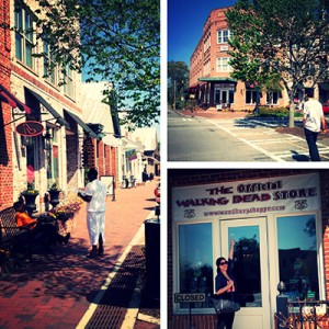
As I mentioned at the beginning, Scott and I are both huge Walking Dead fans. So on our drive from Columbus to the airport in Atlanta, we took a minor detour through Senoia, Georgia. Aside from the fact that this adorable downtown strip was the location for “Woodburry” in Season 3, it had exactly the southern charm one would expect. We spent about an hour perusing the gift shops that were open and peaking into the windows of the antique stores, which, much to our dismay, were all closed on Sundays.
Overall the Creative South design conference was just as awesome as Scott and I hoped it would be, and we came back to the office refreshed and ready to take on the agency world.
Important Handles
- Justin Mezzell
- Twitter (@JustinMezzell)
- Instagram (/@justinmezzell)
- Nathan Yoder
- Twitter (@NathanYoder)
- Instagram (/@nathanyoder)
- Danielle Evans
- Twitter (@marmaladebleue)
- Instagram (/@marmaladebleue)
- Ben Jenkins
- Twitter (@onefastbuffalo)
- Instagram (/@onefastbuffalo)
- Hatch Show Print
- Twitter (@HatchShowPrint)
- Instagram (/@hatchshowprint)
- Helena Price
- Twitter (@Hhelena)
- Instagram (/@helenadagmar)
- Justin Pervorse
- Twitter (@justinpervorse)
- Scott Fuller
- Twitter (@StudioTemporary)
- Focus Lab
- Twitter (@FocusLabLLC)
- Instagram (/@focuslabllc)
- Alonzo Felix
- Twitter (@alonzofelix)
- Instagram (/@alonzofelix)
- Scott Biersack
- Instagram (/@youbringfire)
