It’s a scenario not all that uncommon to content marketers. You’ve crossed your T’s and dotted your I’s on a shiny new piece of content for your site, and it’s ready to publish. Engaging copy? Check. Well-researched facts and relevant background information? Check. Optimization for SEO? Check. A call to action that strikes a chord and motivates readers to book a service, make a reservation, or otherwise engage with your brand? Not so fast.
Today, content marketers pull out all the stops to get their readers to click, engage, and drive further interaction. If you’re not giving your CTAs much thought, you could be letting valuable user interaction slip out of your grasp.
What is a CTA?
A CTA, or call to action, is a statement that’s meant to guide your users to a desired action. Whether you want them to sign up for your newsletter, download an eBook, or buy a product, your CTA is the place to make that clear and concise.
Types of CTAs
When it comes to CTAs, there’s no one-size-fits-all solution. CTAs can be as simple as a line of text with a hyperlink, or include a button, image, or other elements. Your ideal CTA will change depending on what you’re trying to accomplish.
Here are the most common types of CTAs.
Newsletter Signups
You have an email newsletter, and you want people to read it. What’s a content marketer to do? A newsletter signup CTA is the answer. It’s the place to promote your newsletter and get readers to join in.

Our client, Arthur Andrew Medical uses this newsletter CTA with some copy to entice users by letting them know exactly what they’ll receive by signing up.
“Shop Now”
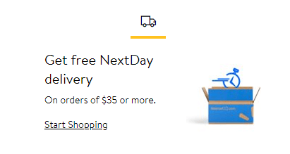
If the ultimate goal of your content is to get people to buy, a “Shop now” CTA is the way to do it. These can be as simple as an “Add to cart” button on a product page or as complex as multiple CTAs for each plan or product offering much like the example below.

Walmart promotes their NextDay delivery service with this CTA prompting users to “start shopping” and receive the benefits of fast shipping.
“Learn More”
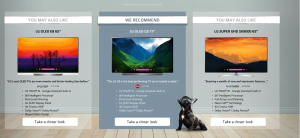
This CTA is one of the most common, but also has the most potential for dynamic applications. At its core, the “learn more” CTA prompts users to find out more information about a given product, service, or brand. The most straightforward form of this is introduction content and a button that says, “Learn more.” But some brands go beyond “learn more” to create actionable CTAs.

Instead of simply giving users the option to learn more about their TVS, LG teases users by leading with top features before inviting them to “Take a closer look” in order to pique their interest.
Social Sharing
Getting users to connect with you on social media means more opportunities to share content and build brand engagement. A well-placed social sharing CTA is one way to make that possible.

Beauty retailer Ulta has a unique spin on a social sharing CTA. Instead of simply presenting a “share” button, they include examples of photos their customers have shared, and encourage users to join in and share their photos as well.
Crafting your CTA strategy
Now that you know some of the most common forms of CTAs, you can start crafting your CTA strategy. Strategy is what separates effective CTAs from forgettable ones. Here’s how to make yours stand out.
Use Actionable Words
Your CTA should convey a sense of urgency, without crossing into desperation. You should be persuading users to click, not begging them. At a glance, users should understand what you want them to accomplish, and how they can make it happen. Some examples include:
- Get the app
- Download now
- Start exploring
- Get started
- Order now
- Register today
- Start saving today
- Sign up now
- Reserve your spot
- Make a reservation
- Read more
- Join the mailing list
Location, Location, Location
It’s not just about what your CTA says—it’s about where it says it. After all, what good is a CTA if nobody can find it? Here are a few locations to consider when placing CTAs:
- At the end of an article
- Within the content itself
- In a sidebar
- On a top banner
- As a pop-up component, also known as a modal
How users interact with a specific page can determine the best location of your CTAs; however, this can change over time. UX (user experience) research tools like clickmaps and heatmaps can show you trends of how users are interacting—or not interacting—with your CTAs. With this data in mind, you can relocate them as necessary and test a new solution.
Don’t Ask for Too Much
Sign up for our newsletter! Also, download our app! Oh by the way, we have new products so go look at those now too! And did you see that we have more blog posts about this topic?
Overwhelming your users with an onslaught of CTAs is a surefire way to get them to click none of them. Narrow it down as much as you can to make it simple, clear, and actionable.

On their homepage, our client Chas Roberts combines three CTAs—view all offers, learn more, and schedule service—in an intuitive layout that doesn’t overwhelm the user.

The example above from Urban Decay is a great way for a CTA to promote more than one thing. By presenting the choice to either learn more about their loyalty program, or to sign up, Urban Decay provides two clear options of next steps for the user.
Next Steps
Think of a book without an ending, or a movie without a third act. That’s what your content is without a CTA. With no “next steps,” users are left wondering why they bothered with your website in the first place. As content marketers, you have the ability to put together a clear roadmap for users of the who, what, when, where, and why of your content. CTAs serve as the directions that bring it all together. So, take this as a call to action to re-think how your content uses CTAs.
