There’s a lot of moving pieces that come together to create a beautiful, yet functional website for a client. Here at Zion & Zion, we focus the intersection of strategy and creativity to create an effective website.
While I’ll be focusing on the basics of building a website from a UX perspective in this article, our Senior Designer addresses the basics of building a website from a design perspective and what happens to the project once it leaves UX’s hands. Let’s begin!
1. Strategy
One aspect we focus on incorporating into a new website is strategy. Before UX begins our web research and wireframe processes, we team up with our internal strategy team, who has already been through an entirely separate process to establish big picture ideas and goals for the client. Once the strategy is nailed down, the UX team is pulled in to understand said ideas and goals to make sure they are apparent throughout the new website.
This helps us not only create an attractive and functional site, but also an effective site that truly aligns with the company’s objectives.
2. Web Research
Before brainstorming the new layout of a website, we dive into our web research process, beginning with a full website audit. Most often, clients come to us with a preexisting website, so we start by taking a closer look at their current website to determine the high points and low points. Of course, we adjust our process for clients who do not already have a website.
To do this, we utilize many research methodologies, ensuring we’re covering all the bases and gathering relevant and insightful research. Now, let’s get into some of the necessities when it comes to web research.
Google Analytics
Google Analytics is a tool that I’d highly recommend to anyone. From a personal website all the way to a large corporate website, Google Analytics generates insightful data. Not only does it offer information like the number of users visiting your website, but you can also set up goals and events to track specific tasks and scenarios that are a priority for your website or research. We determine which data points to look at depending on the industry, a specific page’s purpose, and more.
Below, I review some of my favorite tools within Google Analytics for website research:
- Behavior Flow: Gives us an idea of the steps users are taking while navigating your website.
- Bounce Rate: Tells us what percentage of users come to your website, don’t interact with any given page, and then leave your website.
- Page Views: Tells us the overall number of users visiting the page, which can be very important when prioritizing client business needs and what pages/information they view as high priority.
- Average Time Spent on Page: The average time users stay on a certain page. Comparing this with the contents of a page helps us understand if users are confused, looking for more information, not reading content, etc.
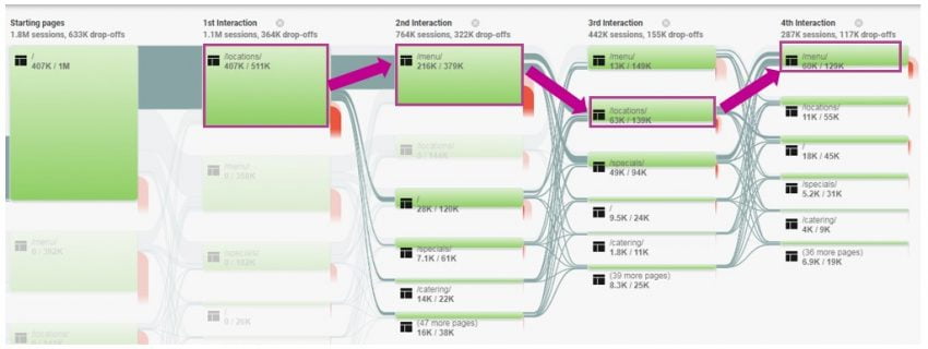
Below is an example of a Behavior Flow, which allows us to understand the steps users are taking while navigating through a website. By analyzing at a chart like this, you can get a better understanding of what pages are being visited, and in what order.
As you can see from the image below, users bounced between Locations -> Menu -> Locations -> Menu. Knowing small, yet useful information like this can help establish a better Information Architecture of the site. In this example, we focused in on why users were navigating back and forth, and back again, to these two pages on the website.

For tips on how to get started with Google Analytics and best practices, check out our article, How to Use Google Analytics for UX Research.
User Testing
User testing comes in all shapes and sizes. It encompasses many different concepts and terms such as usability testing, user research, user interviews, and more. However, they all have the same end-goals in mind:
- What’s working and what’s not working on a website?
- Are users able to successfully complete the task for which they are visiting the site?
User testing platforms like UserTesting, UserZoom, TryMyUI, and more allow us to perform tests that records participant’s screens as well as their audio. That way, we can see what they’re doing and hear what they’re thinking. On top of that, we strategically set the demographic to mirror actual users that would be visiting your website.
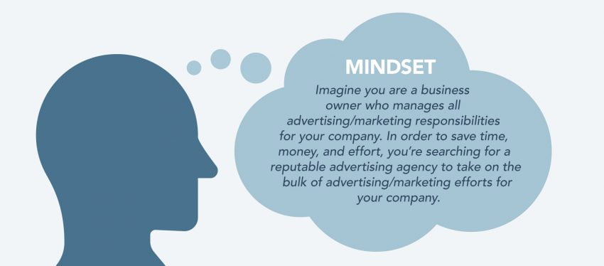
We also create a mindset for our participants to imagine themselves in, which includes specifics about what they’re doing and why they’re doing it so they can navigate through your website. Here’s an example:

We then give participants tasks, or goals, to accomplish on the given website. After they’ve finished their session, our team reviews each test and takes notes on areas of high frustration, usability issues, actions/pages that elicit joy for the user, and more.
Another benefit to conducting user testing is that your website gets a fresh pair of eyes on it. Sometimes it can be difficult to find areas of improvement for something that you helped build or something that you’re close to, like your website, for example.
When taking notes on areas of high frustration, usability issues, and actions/pages that elicit joy for the user, our team creates clips of each instance and compiles them into a highlight reel. A highlights reel is a great way to show quick overviews of problem areas to those who are not actively involved in the project. Take a look at an example user testing highlight reel below, created by the team at TryMyUI.
Preference Tests
This type of test allows us to get an understanding of how your website compares to other companies in your industry. To do this, we use a platform called Usability Hub.
Depending on the client, industries, and goals, we may compare homepages, service pages, career pages, etc. We ask participants why they chose the company they preferred and most times, answers boil down to design, imagery, simplicity, page structure, and sometimes actual content on the page.
Competitor Analysis
Another way we analyze how a website performs against the competition is by conducting a complete competitor analysis. The way we do this varies from client to client, but can be accomplished through a preference test (as mentioned above), or a general in-depth review of your top competitors and the differences in the websites.
For example, we may look to see how competitors are building rapport with their target audience. Are they including testimonials, stats, or personable imagery? What are they doing right, that your website may not be doing?
Click Maps & Tests
These two types of tests have a similar question in mind, what is the user clicking on? However, how we answer that question varies between the click map and click test.
Click Maps
It’s important for us have a general understanding of what users are clicking on as they’re naturally browsing through a website, rather than asking for a specific scenario as we would in UserTesting as mentioned above, or with click tests which will be covered later on.
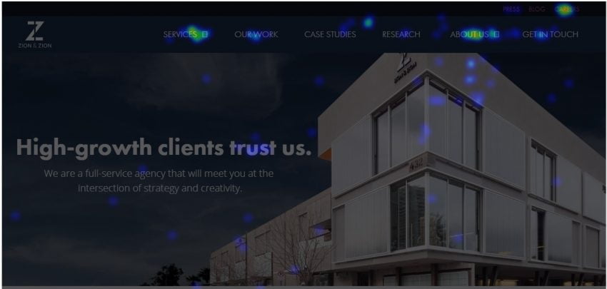
To see what users are clicking on, we use a tool called Inspectlet. In the example below, you can see that the menu items Services, About Us, and Careers receive the highest number of clicks.

Click maps also help us identify usability and design issues. How many times have you clicked on something only to find out it’s not clickable, even though there’s a million and one indicators that it is indeed clickable? Frustrating, right? Well, we can fix that!
Click Tests
This type of test is one of many ways to analyze the Information Architecture of the website. To get an idea of how clear and straightforward a website’s navigation is, we will perform a click test. While the click map is looking at natural browsing behaviors, click tests put users in a scenario.
In the example below, we asked participants where they would click to find more information about renting their own salon.

As you can see, the results are all over the board, which lead our team to rethink the site’s Information Architecture. Results from a click test help us reorganize the main navigation, adjust the naming of each section for intuitive browsing, and establish which pages should fall under each section.
3. Low Fidelity Wireframe
This portion of our website process is where you’ll start to see solutions applied to concerns and issues that came to light during the web research phase.
Our UX team first begins by developing a low fidelity wireframe to establish the overall organization of the website. Low fidelity means that there’s really no design elements added at this point in time. We use placeholder text, boxes, and other sketch-like features to outline the foundation of the site.
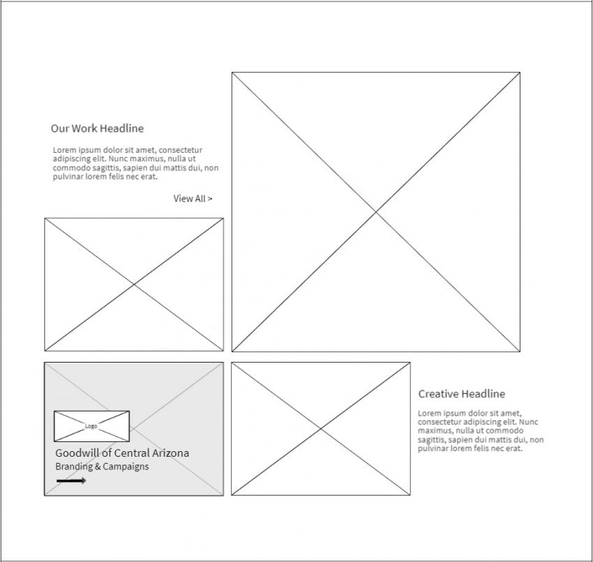
We like to think of low fidelity wireframes like a blueprint of a house. You wouldn’t start to design and build a house before signing off on the blueprint. So, why start to design and code a website before creating the foundation? You wouldn’t (and shouldn’t). The example below is showing a portion of a single page within a low fidelity wireframe for a website.

As you can see in the example above, we included headlines, placeholder text, and boxes with “X” in them which represent images. In addition, we also include hover states and show how they function when a user rolls their mouse over that section. In this particular example, you can see the hover state for the image in the lower left-hand corner. When a user hovers their mouse over the image, an overlay will appear accompanied with a logo, title, and button.
Pass the Torch!
Once the client approves the wireframe, the process then moves on to the design team where they work with the strategy, web research, and wireframe to bring the site to life. Our UX and design teams work closely together to make sure we’re achieving our client’s and their users’ needs. To follow along with our design team’s process, take a look at the basics of building your website from a design perspective.
