As a member of the web development team at Zion & Zion, I was sent to Toronto, Canada where I attended the Smashing Magazine conference. Smashing Magazine is a website that publishes content for web developers and web designers. I was really excited to attend this conference as Smashing Magazine is one of my favorite websites to catch up on the latest development topics and trends. It was a two-day conference that featured a range of design, development, and UX/UI experts. In addition to the conference, I also attended a workshop that focused on the JavaScript Framework, Vue.
One of the most interesting things about this conference, besides the resident DJ spinning tracks between presentations, was the fact that each speaker was challenged to give their presentation without any accompanying slides. This no slides format really pushed the speakers to think outside the box and present their topics in new and exciting ways. Now, for those speaking on development topics, this meant live coding, which is quite the feat! One of the greatest benefits of live coding was the fact that speakers were not only able to walk you through the solution, but they also were able to explain every decision they made and how it helped them to achieve their end goal. You were able to see their entire thought process, not just some code snippets on a slide.

Unexpected UX Consideration
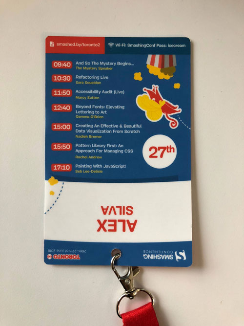
One thing that stood out to me at this conference was the small considerations when creating the conference badges. Beyond serving as identification for all attendees, the badges also conveniently included your personal schedule. Now, this may not sound revolutionary, but the Smashing Magazine team took some extra time to think about how attendees would interact with them. The schedule was printed from the bottom to the top, so when you looked down, you didn’t need to turn it upside down to read your schedule. The badge was printed with the thought that you were most likely going to view it while wearing it around your neck. This shows that UX extends beyond the web.


Imitate, Remix, and Invent
Creating something from scratch can be time consuming. And, sometimes the luxury of time isn’t always on your side. In these moments, you may need to draw inspiration from outside sources. Now, you simply cannot steal an idea because that’s…. stealing. Instead, what you can do is remix it. For example, you may want to recreate a button design from a website. How you make it your own is by remixing it. This includes adjusting the color, background color, font size, padding, and border radius. By the time you are done remixing it, it should be unrecognizable from the original, hence inventing a whole new button. This idea can also be extended to UX/UI for website components and development for code.
CSS Variables
While there wasn’t a single topic dedicated to CSS variables, it was a reoccurring CSS property in many of the development examples. Anyone who uses a CSS preprocessor, like LESS or SASS, is familiar with the concept of variables in CSS. You can define a variable, like color or font size, and use it throughout your code, so whenever that value changes, you only need to edit one line of code.
CSS variables are much more powerful than CSS preprocessor variables. First, they can be used without a preprocessor. And second, CSS variables are accessible through JavaScript, where CSS preprocessor variables are not. Imagine the possibilities! You can directly change the CSS throughout the site without adding any additional classes or inline styles. Of course, IE does not have support, so it might have to be shelved depending on which browsers you support.
:root {
–main-bg-color: brown;
}
section {
color: var(–main-bg-color);
}
Setting Up a Performance Test for Success
Whenever you’re testing performance, it’s important that you test in a neutral environment. You can accomplish this by creating a separate profile in Chrome that does not have any browser extensions. While browser extensions can greatly improve your experience on the web, they can often interfere with performance and can detour you when tracking down issues that affect your site.
Identify Performance Issues
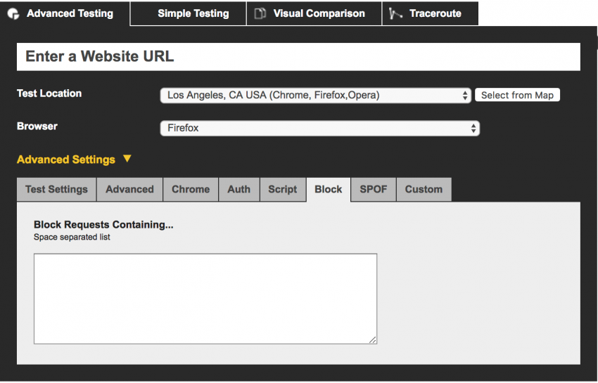
One of the biggest culprits of performance issues are third party scripts. In Chrome dev tools, you can identify third parties with the help of the coverage panel (Command + Shift + P). In the coverage panel, toggle the ‘Show third party badges.’ In a secondary performance test, blacklist these scripts in webpagestest.org to see how your site loads without them. If these scripts dramatically increase page load, consider reaching out and seeing what can be done to improve the performance. Of course, this may not always be an available option, so you may need to weigh how important it is to have this third party script on your site.


Another hidden gem located under the coverage panel is ‘Show Coverage.’ This shows you how much of your scripts and styles are being applied to the current page. It is standard practice to load the CSS for the entire site, but of course, this impacts performance. One option would be to inline the critical CSS and AJAX in the rest of the styles later to boost performance.

